Our Typography
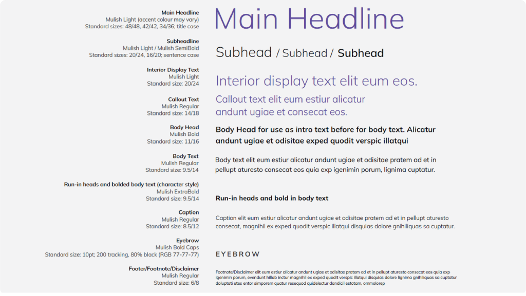
Primary Typeface: Mulish
Mulish is a versatile and modern sans-serif font. Clean, simple lines with a geometric touch make it highly readable at all sizes. A wide range of weights offers great flexibility for different design needs.
Use for branded communications: website | signage | letterhead suite | motion graphics | all other marketing and sales materials.
Mulish is an open-source google font.
Install at fonts.google.com/specimen/Mulish
Typography in use
- Mulish Light and Regular for headlines and body copy.
- Mulish Extra Light for large-scale applications such as signage and tradeshow environments.
- Bold and Semi Bold for subheads and large stats.
- Combine different weights and styles to organise information clearly.
- Align type flush-left to create an easy-to navigate layout.
Type Color Usage
- Main headline text across all sales and marketing collateral: Black, Plum or Violet.
- Special cases such as environmental branding | website | motion graphics | social media : Dark purple gradient
- Intro text: Plum.
- All other text styles: Black or 80% black.

Alternate Typeface: Aptos
Aptos is a pre-installed system font.
Use for PowerPoint and Microsoft® Office products.

Color Usage in Typography
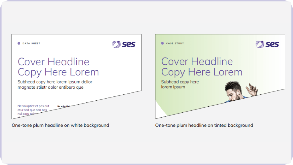
One-Tone: Plum
Use for: Headlines in everyday marketing materials
- Collateral
- PowerPoint
- Data sheets
- Case studies
- Reports

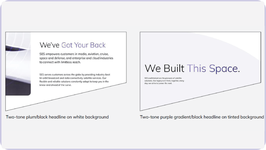
Two-Tone: Plum/Black or Purple Gradient/Back
Use for: Headlines in high-impact promotional materials
- Roll-up banners
- Motion graphics
- Tradeshow / environmental graphics
- Advertising
- Email marketing
