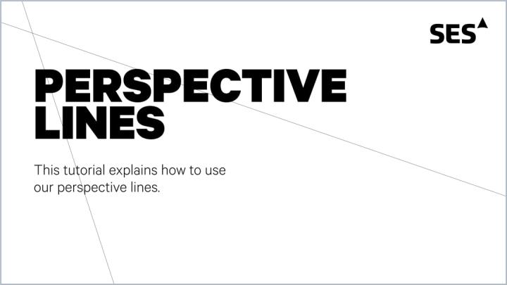
Perspective Line
Perspective lines are without a doubt the most prominent characteristic of the SES brand.
Taken inspiration from our satellite beams, our perspective lines reflect our unique viewpoint on the future.
LINE SETUP
Our perspective lines are not only unique to SES but also in the way they are set up:
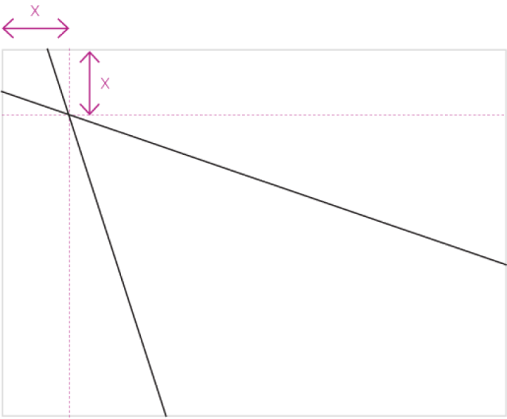
- Crossover point should be equally distanced on both X and Y axis, creating a square.
- The default line weight for A4 or LTR is 0.75pt and should be scale up depending on the layout size to maintain the same level of visibility
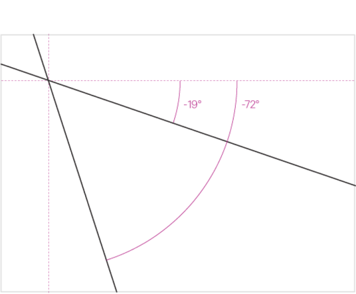
The default angles for perspective lines are -19° and 72° from 0°
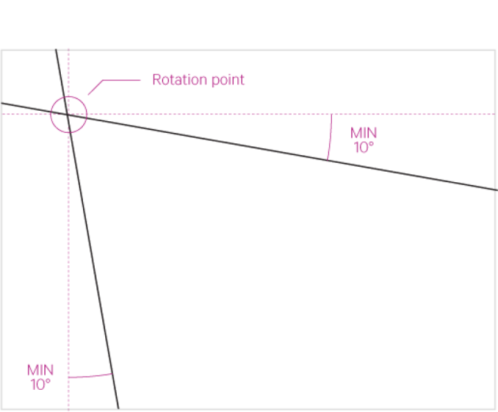
- To avoid disturbing key parts of an image, the lines may be rotated.
- Maintain a minimum of 10° from zero
WITH IMAGERY
Brand Level
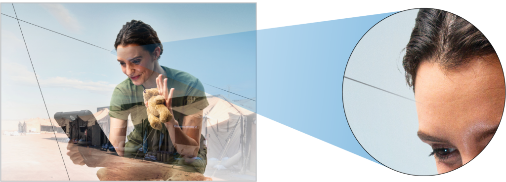
Using brand-level imagery:
- Perspective lines should always be contained within the image
- They should never cross over the brand persona's face and body — progressively fade out as they approach the persona's face/body, and fade into full opacity when channeling away
Secondary Level

Using secondary-level imagery:
- The perspective lines should always completely cross over and lay on top of the full image
- Aim to position the lines so that the subject(s) of the image is not overly obscured and is still visible


