Brand Elements
SES brand in the making
This chapter introduces the building blocks that make up our brand’s visual identity.
Every choice is intentional, from our brandmark, colours, to typography. They all come together to form a cohesive SES brand we know today.
Our Brandmark
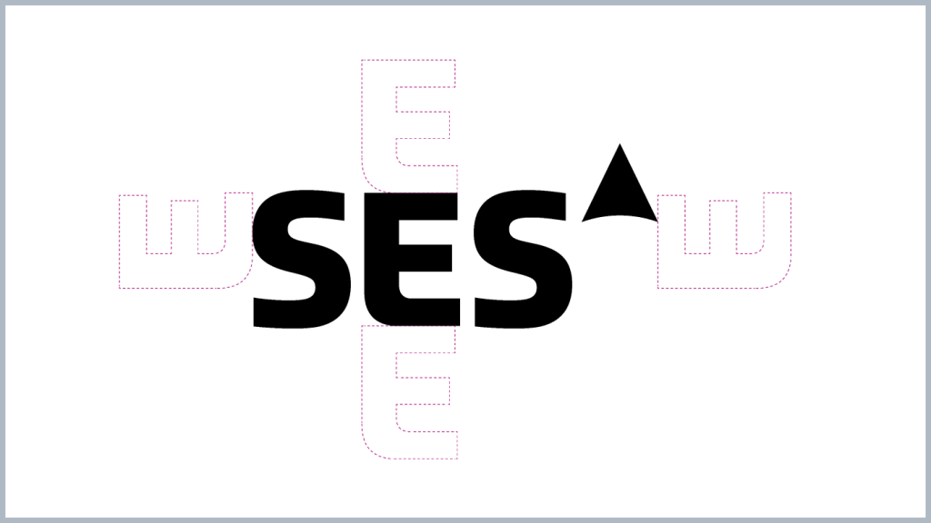
Exclusion Zone
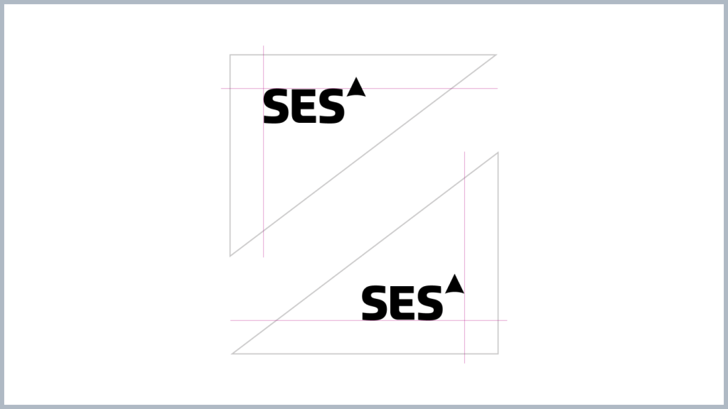
Placement
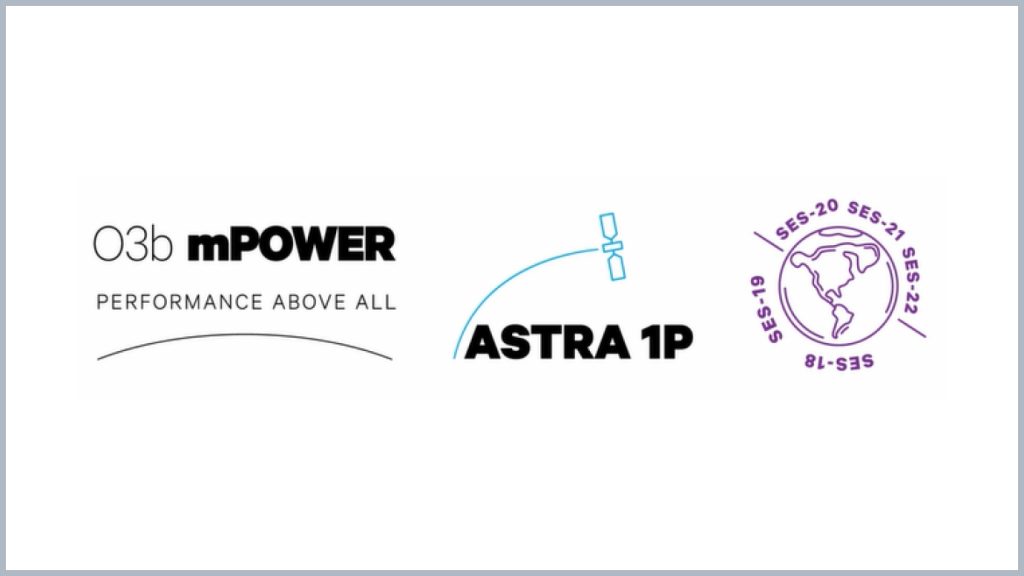
Sub-brand Logos

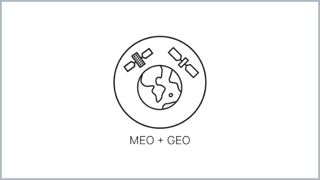
Technology Logos
Partner Logos

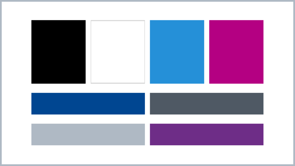
Our Colours
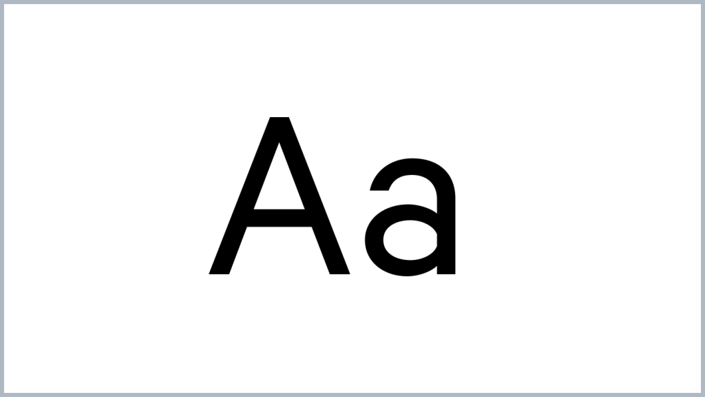
Typography
Line Rule
Perspective Line

Icons